Tufte plots -- it's all in the eyes
 “The only true voyage of discovery, the only fountain of Eternal Youth, would be not to visit strange lands but to possess other eyes”
― Marcel Proust, Remembrance of Things Past, Volume 5 (The Captive), Chapter 2 – the C.K. Scott Moncrieff translation…![]()
![]()
In 2016 I took one of Edward Tufte’s one-day courses – “Presenting Data and Information.” Over time, I’ve come to appreciate the design process of making graphics and presenting results in general. He has a new book out by the way called Seeing with Fresh Eyes. Coincidentally, I pulled the Proust quote for this bore of a post before I checked his website. Anyway, here are my best attempts at making a couple Tufte style plots with matplotlib, pyplot and the ggplot theme.
There are several good libraries for making these statistical plots in R. The most complete one I’ve found is Lukasz Piwek’s Tufte in R. In python, there are a few scripts here and there but no libraries for creating things like sparklines or dot-dash plots, with the one notable exception of Plotly. Making these plots can be a bit tedious given the multi-scale nature of the problem… but still, future-Matt, here are good places to start (if you haven’t already jumped).
One common theme throughout is the necessity of manual tweaking to make things look ‘right’. How you space things will depend on your data, which makes writing one-size-fits-all solutions more difficult. You can dev something to size and rescale all your data, or, just edit it manually. For plots that get created once this seems like an acceptable cost to me.
Marginal histograms
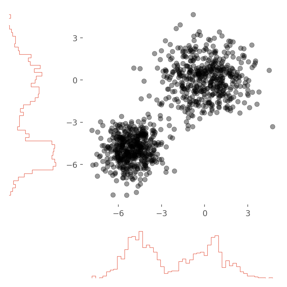
The first plot that caught my eye was the scatter plot with marginal distributions. He calls these dot-dash-plots on page 133 of Visual Display of Quantitative Information (VDQI). The basic ideal is to replace the axes with sparklines a maximize the data/ink ratio. This works best for sparse data in my opinion. For dense data, an actual histogram seems to work better and that’s what I’ll focus on here.
For multi-variate, point data this is a nice way to see all the data and the axis projections. The most difficult part of this plot is keeping track of all the axes and which need to be shared, inverted etc… I started out from this matplotlib tutorial which I would recommend. In newer versions of matplotlib, they’ve made it easier to change the histogram style. I think the histtype='step' makes for a less cluttered plot with less dead space.
ax_histx.hist(x, bins=bins, histtype='step')
ax_histy.hist(y, bins=bins, histtype='step', orientation='horizontal')
Or you can get the same effect by making the bars very narrow. All the information of the plot is as the edges!
ax_histx.hist(x, bins=bins, width=0.07)
ax_histy.hist(y, bins=bins, height=0.07, orientation='horizontal')
This second type of dot-dash-plot is closer to the original ideal of a sparkline. In practice I found creating a dash spark line to be a bridge too far for me though I believe it could be done.
A copy of the notebook is also posted on nbviewer if you’d like to take a closer look or run things yourself in a mybinder.
Box plots
A slightly easier plot to make is the mini-box plot. Basically a striped down version of the standard statistical box plots (see Ch. 6 of VDQI). For this one, the easiest path was to just draw lines to represent the standard deviation of the data. A fudge s_factor helps space the lines from the data points when the standard deviation is large. Otherwise, the error is just split in two and drawn up and down from the data point.
plt.plot(x,y, '.', markersize=6, zorder=2)
for x_i,y_i,yerr_i in zip(x,y,yerr):
    x1, y1 = [x_i, x_i], [(y_i + s_factor*yerr_i/2), (y_i + yerr_i/2)]
    x2, y2 = [x_i, x_i], [(y_i - s_factor*yerr_i/2), (y_i - yerr_i/2)]
    plt.plot(x1, y1, marker = '', color='lightgray', zorder=1)
    plt.plot(x2, y2, marker = '', color='lightgray', zorder=1)
A similar approach could be taken for error in the x direction. Note the zorder of the data and lines. Here, especially if the standard deviation is small, we want the data points to sit on top of the lines.
Take a look or run the notebook here.
Sparklines
Last and maybe least are the classic Tufte sparklines.
This plot in particular can be difficult to get right. If you’re going to stack data on top of other data, you’re definitely going to have to scale it. I was careful to separate the scaled data and the original data values. This allowed you to plot the scaled data and annotate it with the real data values:
for idx, ddata in enumerate(zip(dataz, labelz)):
    #scale data

    # offset data series
    sdata = rescale_data(ddata[0])
    data = sdata + idx*space_factor
    ax.plot(data, 'black', alpha=0.4)
Here’s a quick demo of the final product with real stock data:
# grab the 2019 annual close price for a handful of public companies
assets = ['AAPL', 'MSFT', 'TSLA', 'RTX', 'GOOG', 'FB']
data = []
for i, asset in enumerate(assets):
    data.append(yf.download(asset,
                start='2019-01-01',
                end='2019-12-31',
                progress=False)['Close'])
# plot the data in a sparkline collection
f, _ = create_spark_lines([ data[i] for i in range(len(data))],
                          [a for a in assets],
                          space_factor = 6,
                          text_offset=250,
                          font_size=15,
                          marker_cutoff=10)
f.patch.set_facecolor('white')
plt.rcParams['axes.facecolor']='w'
plt.tight_layout()
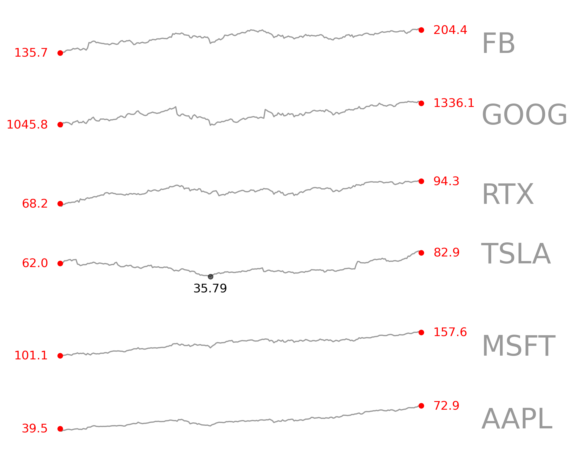
View and run the notebook here.